
Jewellery for Change

“Jewellery for change” is an entrepreneurial project all about expanding our perception of what a piece of jewellery is, what it can do and what it can possibly change. Within the jewellery world, we will challenge the boundaries and see how far we can take jewellery.
This 12 week project includes everything a business must consider from market and consumer analysis, concept development, experience economy, design and service to marketing production and sales; with the ultimate purpose: to create a change in the consumer.
View full
catalog
Design Process
RESEARCH ABOUT CHANGE
Before we could start developing any ideas it was important to understand what 'change' meant to us and to those whom would become our target group. This resulted in a list of small changes in daily life that everyone could make to reduce their ecological footprint and to achieve a more sustainable lifestyle, with the major change being about producing less waste.
From here we did more in depth research on sustainable design and the market for such products, finding out that many sustainable designs were very expensive, not easily accessible or there was a lack of trust in the brand from the consumers. And that although when asked the majority of those we interviewed were very open to sustainable design and reducing their ecological footprint, they did not respond well to being confronted with the issue of sustainability. This meant we would have to find the right angle when marketing a sustainable product

"How can we make appealing and affordable jewellery by upcycling local waste, helping to raise awareness of our modern throw away culture?"
IDEATION & INSPIRATION
“Frugal Innovation”, is a concept that captured our interest.
Frugal Innovation is about reducing the use of the earth’s scarce resources and doing “more with less”. A concept that become a core value of our project and provided us with inspiration.
This lead us to work with leftover materials from local design companies, who shared our interested in producing less waste.
We were searching for some inspiration for sustainable designs incorporating natural materials from various trend forecast books.
The trend “Wonder Wild” from Nelly Rodi’s “Decor & Atmosphere” book for fall/winter 2015/2016 matched our concept really well and inspired us in terms of design and branding.


Harmony + serenity
Natural nordic woods
Shapes explore the many facets of nature
Imperfections + little accidents create the charm
Organic forms are inspired by plants and minerals
Luxurious simplicity
Quality natural materials
Sophisticated minimalism
Essential
Authentic
Fine craftsmen
Crystallized elements
Nordic forests
Natural treasures
PROTOTYPES & TESTING
We formed various kinds of wood and combined them with aluminium to imitate silver and tried out different placements on the body until we had some designs we were happy to work further with and refine.
The most common responses were that people liked the faceted wood’s similarity with a cut gemstone. They liked the contrast of creating one faceted “stone” made of two very different materials and textures.
Feed back on our concept was generally very positive, it being important that we were recycling high quality materials.
PRODUCTION METHODS
Our production was a combination of casting and handcraft. Finding a balance between these two techniques gave our collection a cohesive feeling even though every piece turned out differently when handmade.
Working with two very different materials, with two different production techniques and attempting to make them look like one piece took a good deal a practise and considerable amount of time per piece. This resulted in a lack of consistensy across the whole collection.
For the quality to become consistent across the whole collection, other techniques should be considered instead of sand the wood to shape by hand or perhaps another material that could be casted or 3D printed.
But one could argue that the 'little flaws' and individuallity of each piece adheares to the brand value.


We want to create more awareness of the consequences of our modern throwaway culture and show people that quality, sustainable products can be affordable for everybody. We achieve this by using leftover wood, leather and silver from local designers. The name Phacets reflects our designs and all the phases our materials have gone through.

BRANDING
We used a more casual approach with our branding material, so that it would have a local handcraft appearance. Beacuse we found out that people generally do not want to be taught about sustainability. This is why we chose to brand our collection in a more discrete manner without emphasizing the recycling part too much, which also gave moreattention to the 'one of a kind' design of the jewellery and not just the concept.
This is actually where I feel we were weakest.
By not promoting our values and concept we lost our unique selling proposition. Our visual identity should have reflected more on our brand and collection.
I think if we had have used Emotional Design effectively that we would have been much more successful. This would have really made a connection between the consumers and the values of Phacets.
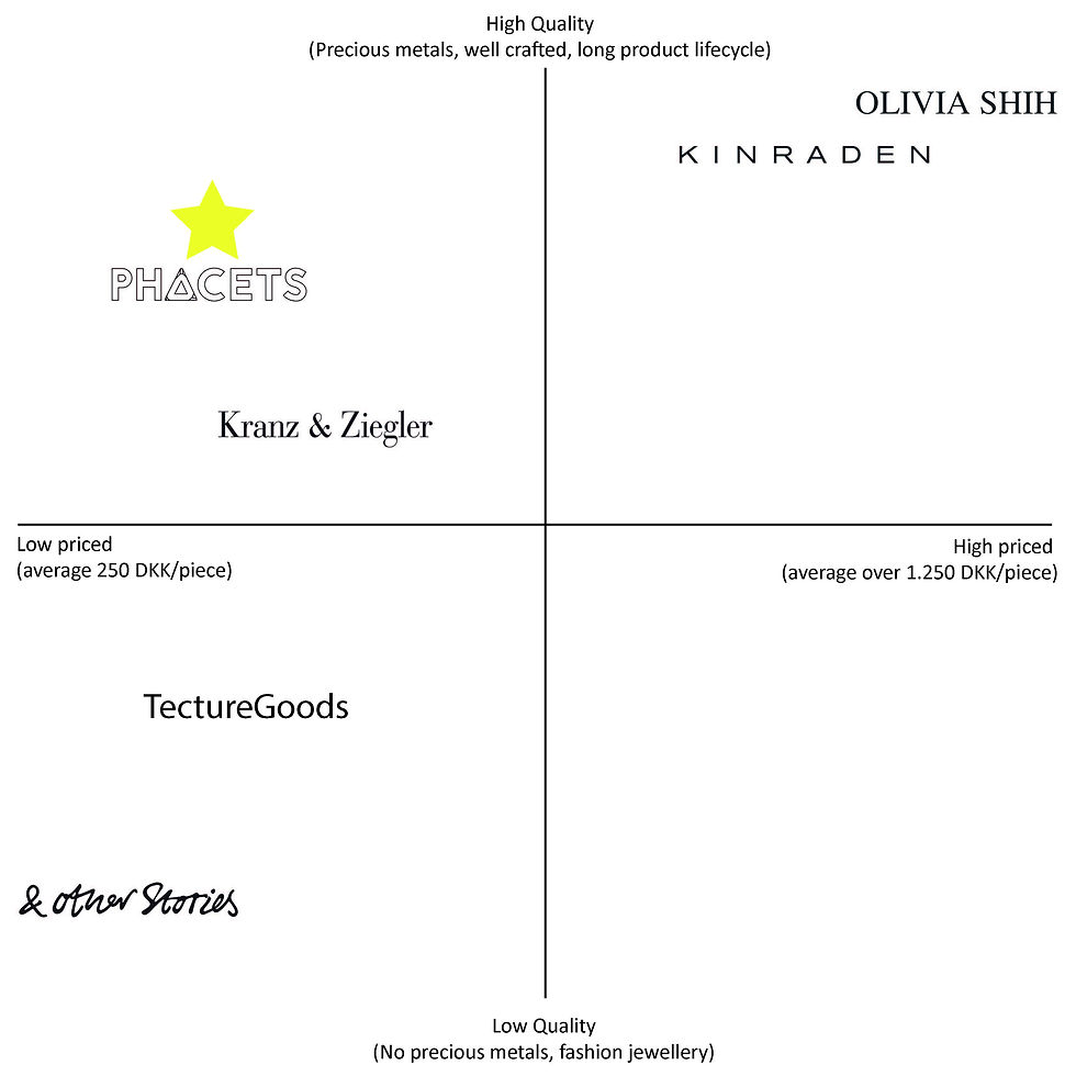
Using SWOT analysis and a Business Model Canvas were really good tools for us to understand what challenges we could expect during this 12 week project and helped us focus on where we could improve. The Positioning Map helped us to compare ourselves to existing brands and help us narrow down where we wanted to be in the market.
BUSINESS ANALYSIS


TARGET GROUP REFLECTION
Our target group for this project was women twenty-five to thirty-five in age who were conscious of sustainability issues even if they didn’t fully live a sustainable lifestyle. We found out that we received a lot of attention outside of this bracket proving that our target group was not exactly on point. The biggest difference we noticed was that a lot of men seemed interested in our products and concepts. The wood, with the addition of the matte silver, is what I believe attracted a lot of men to our jewellery, especially when side by side with a lot of other more feminine, high polished pieces.
This is why I chose to re-design our collection for my exam as gender-neutral collection. The idea of having a gender-neutral collection fits better into the Phacets vision of a frugal design as it would save time and resources that would be spent on marketing to both men and women and will allow more focus on the design and what we are trying to convey with it. I believe that having a clear definition between pieces that are targeted at men and those targeted at women would create a disconnect in the collection. Blurred gender lines and gender fluidity is becoming a popular trend and more mainstream.